Tutorial 4: Trajectory data mining in Python#
Attention
Finnish university students are encouraged to use the CSC Notebooks platform.
![]()
Others can follow the lesson interactively using Binder. Check the rocket icon on the top of this page.
In this tutorial, we will learn how to conduct exploratory space-time data analysis (ESTDA) based on movement data. When analyzing mobility data, using various visualization approaches (visual analytics) is important to be able to understand the data and extract insights from it. Here, we will learn a few tricks how we can manipulate movement data and visualize it using static and interactive visualizations in Python.
Attribution
This tutorial is partly based on excellent resources provided by Anita Graser and the documentation of movingpandas library.
import pandas as pd
from keplergl import KeplerGl
import geopandas as gpd
import movingpandas as mpd
from datetime import datetime, timedelta
import plotly.express as px
import warnings
warnings.simplefilter("ignore")
Input data#
In this tutorial, we will use AIS data that describes vessel movements (obtained from movingpandas). The AIS data has been published by the Danish Maritime Authority. The AIS record sample extracted for this tutorial covers vessel traffic on the 5th July 2017 near Gothenburg. Let’s start by reading it and checking how the data looks like:
# Filepath
fp = "data/ais.gpkg"
data = gpd.read_file(fp);
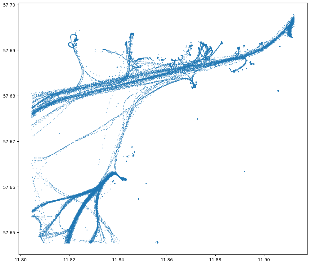
data.plot(figsize=(12,12), markersize=0.7, alpha=0.7)
<Axes: >
data.shape
(84702, 8)
# Check first rows
data.head()
| Timestamp | MMSI | NavStatus | SOG | COG | Name | ShipType | geometry | |
|---|---|---|---|---|---|---|---|---|
| 0 | 05/07/2017 00:00:03 | 219632000 | Under way using engine | 0.0 | 270.4 | None | Undefined | POINT (11.85958 57.68817) |
| 1 | 05/07/2017 00:00:05 | 265650970 | Under way using engine | 0.0 | 0.5 | None | Undefined | POINT (11.84175 57.66150) |
| 2 | 05/07/2017 00:00:06 | 265503900 | Under way using engine | 0.0 | 0.0 | None | Undefined | POINT (11.90650 57.69077) |
| 3 | 05/07/2017 00:00:14 | 219632000 | Under way using engine | 0.0 | 188.4 | None | Undefined | POINT (11.85958 57.68817) |
| 4 | 05/07/2017 00:00:19 | 265519650 | Under way using engine | 0.0 | 357.2 | None | Undefined | POINT (11.87192 57.68233) |
Okay as we can see, we have around 80,000 recorded observations and information about the timestamp, geometry, ship type etc. SOG column contains information about speed over ground. Let’s take a look at the data distribution:
data['SOG'].hist(bins=100, figsize=(15,3))
<Axes: >
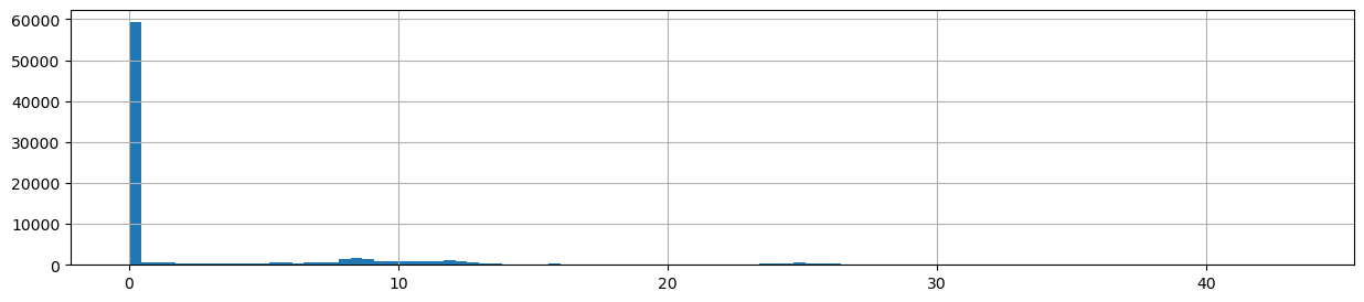
As we can see, most of the observations are actually such where the vessels have not been moving, i.e. they are staying at the harbor. It is not useful to keep such records in our data, so let’s get rid off those:
data = data[data.SOG>0].copy()
data.shape
(33593, 8)
Okay, now we have much less observations. Let’s at this point calculate x and y coordinates based on our Point geometries, so that we can easily plot our data in 3D:
# Calculate x and y coordinates
data["x"] = data["geometry"].x
data["y"] = data["geometry"].y
data.head()
| Timestamp | MMSI | NavStatus | SOG | COG | Name | ShipType | geometry | x | y | |
|---|---|---|---|---|---|---|---|---|---|---|
| 6 | 05/07/2017 00:00:28 | 265647200 | Moored | 0.1 | 298.0 | None | Undefined | POINT (11.89120 57.68569) | 11.891205 | 57.685688 |
| 7 | 05/07/2017 00:00:31 | 265663280 | Under way using engine | 0.1 | 131.6 | None | Undefined | POINT (11.87037 57.68194) | 11.870370 | 57.681937 |
| 22 | 05/07/2017 00:01:03 | 219632000 | Under way using engine | 0.1 | 233.9 | None | Undefined | POINT (11.85958 57.68817) | 11.859583 | 57.688167 |
| 32 | 05/07/2017 00:01:30 | 265663280 | Under way using engine | 0.1 | 348.6 | None | Undefined | POINT (11.87037 57.68194) | 11.870368 | 57.681942 |
| 85 | 05/07/2017 00:03:35 | 376474000 | Under way using engine | 8.8 | 229.2 | LARGONA | Cargo | POINT (11.91198 57.69591) | 11.911977 | 57.695910 |
Constructing trajectories#
Next, we want to convert our individual point observations into trajectories. This can be done easily using the TrajectoryCollection functionality / class provided by movingpandas (see docs). To be able to use this functionality, we first need to parse a DateTime index based on the Timestamp column, and that the MMSI number (Maritime Mobile Service Idenity) is used as the unique id for a ship. We also specify that the minimum length for a trajectory needs to be at least 100 meters:
# Create trajectories
data['time'] = pd.to_datetime(data['Timestamp'], format='%d/%m/%Y %H:%M:%S')
data = data.set_index('time')
# Specify minimum length for a trajectory (in meters)
minimum_length = 100
collection = mpd.TrajectoryCollection(data, 'MMSI', min_length=minimum_length)
# What did we get?
collection
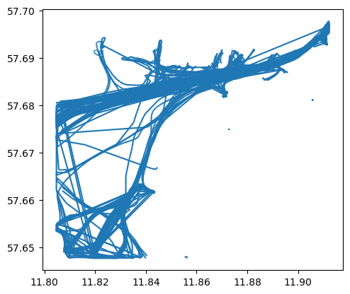
TrajectoryCollection with 77 trajectories
As a result, we get an object that represents the collection of trajectories identified by movingpandas. We can plot all the trajectories easily by:
# Plot all trajectories
collection.plot()
<Axes: >
We can access each of these trajectories individually by looping over our collection. We can also easily calculate the speed and add information about the direction of movement to our data by:
for trajectory in collection.trajectories:
# Calculate speed
trajectory.add_speed(overwrite=True)
# Determine direction of movement
trajectory.add_direction(overwrite=True)
# Let's first check only the first trajectory (i.e. stop iteration after first run)
break
Let’s see what we got. We can access the DataFrame of the given trajectory by:
trajectory.df.head()
| Timestamp | MMSI | NavStatus | SOG | COG | Name | ShipType | geometry | x | y | speed | direction | |
|---|---|---|---|---|---|---|---|---|---|---|---|---|
| time | ||||||||||||
| 2017-07-05 17:32:18 | 05/07/2017 17:32:18 | 210035000 | Under way using engine | 9.8 | 52.8 | NORDIC HAMBURG | Cargo | POINT (11.80462 57.67612) | 11.804620 | 57.676125 | 5.037170 | 51.697066 |
| 2017-07-05 17:32:28 | 05/07/2017 17:32:28 | 210035000 | Under way using engine | 9.8 | 51.0 | NORDIC HAMBURG | Cargo | POINT (11.80528 57.67641) | 11.805283 | 57.676405 | 5.037170 | 51.697066 |
| 2017-07-05 17:32:36 | 05/07/2017 17:32:36 | 210035000 | Under way using engine | 9.8 | 51.0 | NORDIC HAMBURG | Cargo | POINT (11.80528 57.67641) | 11.805283 | 57.676405 | 0.000000 | 0.000000 |
| 2017-07-05 17:32:38 | 05/07/2017 17:32:38 | 210035000 | Under way using engine | 9.8 | 51.0 | NORDIC HAMBURG | Cargo | POINT (11.80528 57.67641) | 11.805283 | 57.676405 | 0.000000 | 0.000000 |
| 2017-07-05 17:32:48 | 05/07/2017 17:32:48 | 210035000 | Under way using engine | 9.7 | 52.0 | NORDIC HAMBURG | Cargo | POINT (11.80668 57.67699) | 11.806675 | 57.676992 | 10.569682 | 51.737848 |
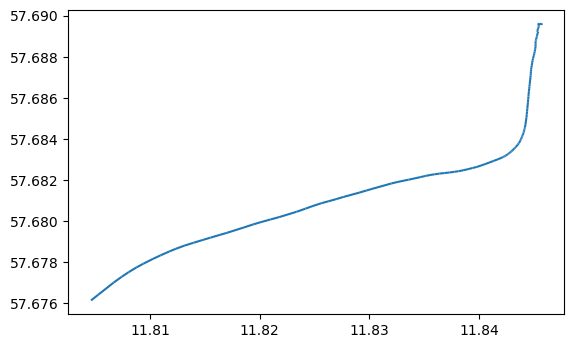
As we can see, now we have new columns speed and direction added to the data which contain information about the speed and direction. We can plot the single trajectory using geopandas:
trajectory.plot()
<Axes: >
This kind of individual trajectory is not very informative as such. We can add more context to our visualization by adding a background map and making it interactive. Movingpandas provides an easy-to-use api to plot the trajectory on top of OSM basemap with Holoviews/Bokeh:
trajectory.hvplot(frame_height=600, frame_width=800, line_width=3, line_color="red")
This map provides much more contextual information and makes it possible to understand that the trajectory is a ship which is approaching or leaving the harbor of Gothenburg (tricky to say at this point).
Exploratory analysis with Space Time Cube (STC)#
It is also fairly easy to visualize our trajectory in 3D using space time cube, in which the 3rd dimension is based on time. There are different libraries that can be used for plotting data in 3D, but we will use here plotly library which provides a relatively easy and straightforward API to generate 3D visualizations. For plotting data in 3D Let’s first modify our datetime information a bit, and only keep the time because all of our values are from the same date (5th of July, 2017):
# Extract the time component
trajectory.df["time"] = pd.to_datetime(trajectory.df["Timestamp"]).dt.strftime("%H:%M")
# Plot the trajectory in space-time cube
fig = px.line_3d(trajectory.df, x="x", y="y", z="time", color='MMSI')
fig.update_traces(line=dict(width=5))
# Want to get background map as well? It is possible:
# https://chart-studio.plotly.com/~empet/14397/plotly-plot-of-a-map-from-data-available/#/
fig.show()
Great, now we can see our trajectory in 3D! Based on this viusalization we can already understand our data a bit better. We can for example, see how the ship has slowly approached the harbor and then docked around 18:00 when the movement has stopped (i.e. x/y coordinates do not change anymore). In a similar manner, we can process all our trajectories and plot them all together:
trajectories = []
i = 0
for trajectory in collection.trajectories:
# Calculate speed
trajectory.add_speed(overwrite=True)
# Determine direction of movement
trajectory.add_direction(overwrite=True)
# Parse time component (as datetime)
trajectory.df["t"] = pd.to_datetime(trajectory.df["Timestamp"])
# Add unique id for each trajectory
trajectory.df["tid"] = i
# Add to container
trajectories.append(trajectory.df)
i+=1
# Convert the list into GeoDataFrame
trajectories = pd.concat(trajectories)
# Reorder the data based on timestamp
trajectories = trajectories.sort_values(by="t").reset_index(drop=True)
# Plot them all (use trajectory id to separate trajectories)
fig = px.line_3d(trajectories, x="x", y="y", z="t", color='MMSI')
fig.update_traces(line=dict(width=5))
# Want to get background map as well? It is possible:
# https://chart-studio.plotly.com/~empet/14397/plotly-plot-of-a-map-from-data-available/#/
fig.show()
The 3D visualization of multiple trajectories can look a bit messy (a bit like spaghetty), but we can already identify some patterns from the spate-time data. Looking at how the trajectories cluster in the STC, it is evident that there is a lot of activity throughout the day. There are two clear clusters in the data which basically represent activity related to two harbors in the area (Gothenburgs harbor and Saltholmens Brygga). From the data you can see how ships and boats are steadily approaching the harbors using more or less the same routes (at different times). Looking at the data, we can also see that one ship stayed the whole day in the harbor without moving anywhere (vertical line without movement).
Aggregating trajectories#
As we can saw from the previous examples, looking at the movement data in 3D using STC can provide interesting insights that can be tricky to understand otherwise. However, understanding and reading the information takes a bit of time and experience before you start to understand what is going on in the data. There are however more tricks that we can do, to abstract our data and make it easier to understand in 2D. Movingpandas provides a handy tool called TrajectoryCollectionAggregator (see docs) which can be used to aggregate the trajectories by extracting clusters of significant trajectory points and computing flows between the clusters. These significant points of trajectories include e.g. their start and end points, the points of significant turns, and the points of significant stops, i.e. pauses in the movement (Andrienko & Andrienko, 2011). Once the points have been detected, then they are grouped based on their spatial proximity and flows are generated between them. We can aggregate the movement data following this approach easily with movingpandas, by specifying minimum and maximum threshold distances between significant points and minimum duration (in seconds) required to detect a stop from the data:
# Aggregate trajectories
agg = mpd.TrajectoryCollectionAggregator(collection, min_distance=500, max_distance=2000, min_stop_duration=timedelta(minutes=10))
# Get flows and clusters
flows = agg.get_flows_gdf()
clusters = agg.get_clusters_gdf()
As a result, we get DataFrames having information about weight of the flows as well as the size of the cluster:
flows.head()
| geometry | weight | |
|---|---|---|
| 0 | LINESTRING (11.80737 57.67704, 11.82295 57.68606) | 40 |
| 1 | LINESTRING (11.82295 57.68606, 11.84298 57.68311) | 41 |
| 2 | LINESTRING (11.81434 57.65202, 11.83678 57.65951) | 79 |
| 3 | LINESTRING (11.83678 57.65951, 11.84298 57.68311) | 9 |
| 4 | LINESTRING (11.84298 57.68311, 11.87490 57.68653) | 47 |
clusters.head()
| geometry | n | |
|---|---|---|
| 0 | POINT (11.80737 57.67704) | 104 |
| 1 | POINT (11.84298 57.68311) | 169 |
| 2 | POINT (11.81434 57.65202) | 131 |
| 3 | POINT (11.87490 57.68653) | 167 |
| 4 | POINT (11.91230 57.69633) | 0 |
Based on this information, we can create an interactive map that provides more easily understandable view for our spatio-temporal movement data:
# Plot with Holoviews
( flows.hvplot(title='Generalized aggregated trajectories', geo=True, hover_cols=['weight'], line_width='weight', alpha=0.5, color='#1f77b3', tiles='OSM', frame_height=400, frame_width=400) *
clusters.hvplot(geo=True, color='red', size='n') )
Great! As a result, we have a map which is quite easy to interpret with width of the line representing the volume of vessels moving between specific locations. We were able to get a sense of these patterns by looking at the movement data in 3D (i.e. where lot’s of movement happens), but following this aggregation approach and visualizing the movement flows makes it much easier to get a grasp of the data.
Animating and exploring the trajectory characteristics in 3D#
The previous approaches have provided useful ways to extract information from movement data. Next, we will see how we can extract further characteristics based on the data using a WebGL based interactive visualization tool developed by Uber: Kepler.gl.
Let’s first manipulate our movement data a bit so that we can visualize it easily in 3D using Kepler.gl. Basically, what we want to do is to generate line segments between all observations in our data and convert them into Polygons by making a small buffer around them. This trick is needed to be able to take advantage of the full 3D capabilities of Kepler.gl. Let’s start by preparing a couple of helper functions that generates the segments and converts them into a Polygon:
from shapely.geometry import LineString
def to_linestring(row):
if row["end_geometry"] is not None:
return LineString([row["geometry"], row["end_geometry"]])
def prepare_segments(trajectory):
# Calculate segments for a single trajectory
df = trajectory.df.join((trajectory.df["geometry"].shift(-1).to_frame().rename(columns={'geometry': 'end_geometry'})))
# Create linestring
df["segment"] = df[["geometry", "end_geometry"]].apply(to_linestring, axis=1)
# Update geometry column with segments
df["geometry"] = df["segment"]
# Drop empty geoms (there is one after converting from points to lines)
df = df.dropna(subset=["geometry"])
# Drop unnecessary columns
df = df.drop(["segment", "end_geometry"], axis=1)
# Convert lines to polygons, so that volume/height can be adjusted
df["geometry"] = df.buffer(0.0002)
return df
movements = []
for trajectory in collection.trajectories:
# Parse direction of movement using movingpandas function
trajectory.add_direction(overwrite=True)
# Parse speed using movingpandas function
trajectory.add_speed(overwrite=True)
# Create segments and calculate some useful statistics
segments = prepare_segments(trajectory)
movements.append(segments)
# Increase index
i+=1
# Concatenate
movements = pd.concat(movements)
# Reset index
movements = movements.reset_index(drop=True)
# Drop "time" column which is in datetime format (Kepler.gl don't like it when saving the output)
movements = movements.drop(["time"], axis=1)
# Convert speed values to integer (to avoid issues with KeplerGl height)
movements["speed"] = movements["speed"].round(0).astype(int)
# What did we get?
movements.head()
| Timestamp | MMSI | NavStatus | SOG | COG | Name | ShipType | geometry | x | y | speed | direction | t | tid | |
|---|---|---|---|---|---|---|---|---|---|---|---|---|---|---|
| 0 | 05/07/2017 17:32:18 | 210035000 | Under way using engine | 9.8 | 52.8 | NORDIC HAMBURG | Cargo | POLYGON ((11.80521 57.67659, 11.80522 57.67660... | 11.804620 | 57.676125 | 5 | 51.697066 | 2017-05-07 17:32:18 | 0 |
| 1 | 05/07/2017 17:32:28 | 210035000 | Under way using engine | 9.8 | 51.0 | NORDIC HAMBURG | Cargo | POLYGON ((11.80548 57.67641, 11.80548 57.67639... | 11.805283 | 57.676405 | 5 | 51.697066 | 2017-05-07 17:32:28 | 0 |
| 2 | 05/07/2017 17:32:36 | 210035000 | Under way using engine | 9.8 | 51.0 | NORDIC HAMBURG | Cargo | POLYGON ((11.80548 57.67641, 11.80548 57.67639... | 11.805283 | 57.676405 | 0 | 0.000000 | 2017-05-07 17:32:36 | 0 |
| 3 | 05/07/2017 17:32:38 | 210035000 | Under way using engine | 9.8 | 51.0 | NORDIC HAMBURG | Cargo | POLYGON ((11.80660 57.67718, 11.80662 57.67718... | 11.805283 | 57.676405 | 0 | 0.000000 | 2017-05-07 17:32:38 | 0 |
| 4 | 05/07/2017 17:32:48 | 210035000 | Under way using engine | 9.7 | 52.0 | NORDIC HAMBURG | Cargo | POLYGON ((11.80735 57.67746, 11.80736 57.67747... | 11.806675 | 57.676992 | 11 | 51.737848 | 2017-05-07 17:32:48 | 0 |
Okay, now we have prepared our data and we can visualize it with Kepler.gl. What we will do next is to:
Determine the attribute which is used for coloring the trajectories (name)
Add a filter based on timestamp
Animate the movements with a selected time window
Determine that the height of data is based on the speed so that we can easily see areas and segments where the ships/boats have been moving fast
Notice, that these will be done using the graphical interface of Kepler.gl, hence, you need to check the video to understand how to repeat the steps. Initializing the Kepler.gl and adding our movement data to it is easy:
# Select a few sample trajectories for demonstration purposes
selected = movements.loc[movements["tid"]< 20].copy()
# Select only needed columns
selected = selected[["Timestamp", "Name", "geometry", "speed"]]
# Create a basemap
m = KeplerGl(height=800, width=800)
# Add the movement data
m.add_data(selected, "trajectories")
# Render the map / interface
m
User Guide: https://docs.kepler.gl/docs/keplergl-jupyter
Once, we have prepared our visualization in a way how we want it, we can easily save our map into a dedicated html website with the current state of the page by:
m.save_to_html(file_name='Trajectories_3D.html')
Map saved to Trajectories_3D.html!